   |
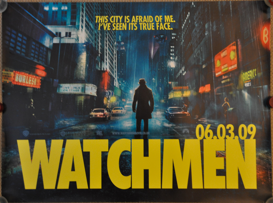
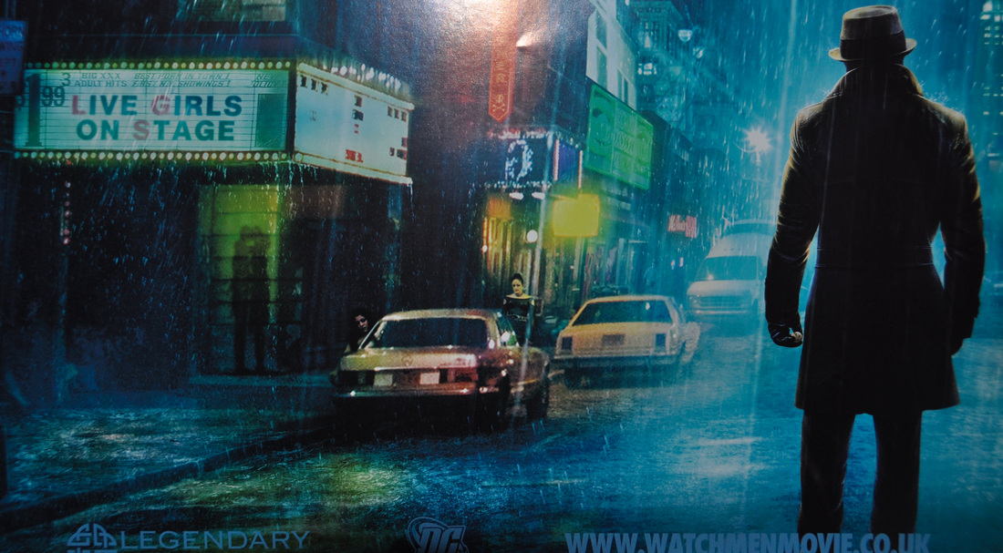
Watchmen
Double Sided UK Quad, Rolled, 30 x 40 inches
As well as films, I also love comics, so it was with some trepidation that I approached the film adaptation of Watchmen. I really admire aspects of it; the opening credits, Rorschach and Dr Manhattan, the production design and how meticulous and uncompromising aspects of the film are. Some of it is a bit bizarre (the overly graphic violence, the sex scene, Wagner over the Vietnam scene), my biggest complaint is probably that it lacks the heart that the comic has. Synder can make a pretty looking frame, but the film just feels a bit bland and soulless (a bit like the Sin City film). I bought the Ultimate Cut recently (which has the ‘Tales of the Black Freighter’ animation inserted into it), so maybe I’ll sit down and re-assess it…but I think I’d rather read Moore’s novel again (if you haven’t read it, DC’s Absolute Edition has beautiful over sized art and some nice extras). I quite like the quad artwork as it teases you with Rorschach’s back instead of his revealing his famous mask, the city is suitably grimey and they kept the title font and colour from the comics. There was quite a varied poster campaign, but this is probably my favourite of the posters for the film. |
Related Posters